Case Study

Ulaman Eco Luxury Resort

Some places reveal themselves slowly. Ulaman is one of them. The brief wasn't to document a resort — it was to translate a feeling that most guests can't fully articulate until they've already left.

PROJECT SPECS
Icon
Client
Ulaman Eco Luxury Resort, Indonesia
Icon
Role
Content Creation
ABOUT

Not built to impress at first glance.
Built to stay with you.

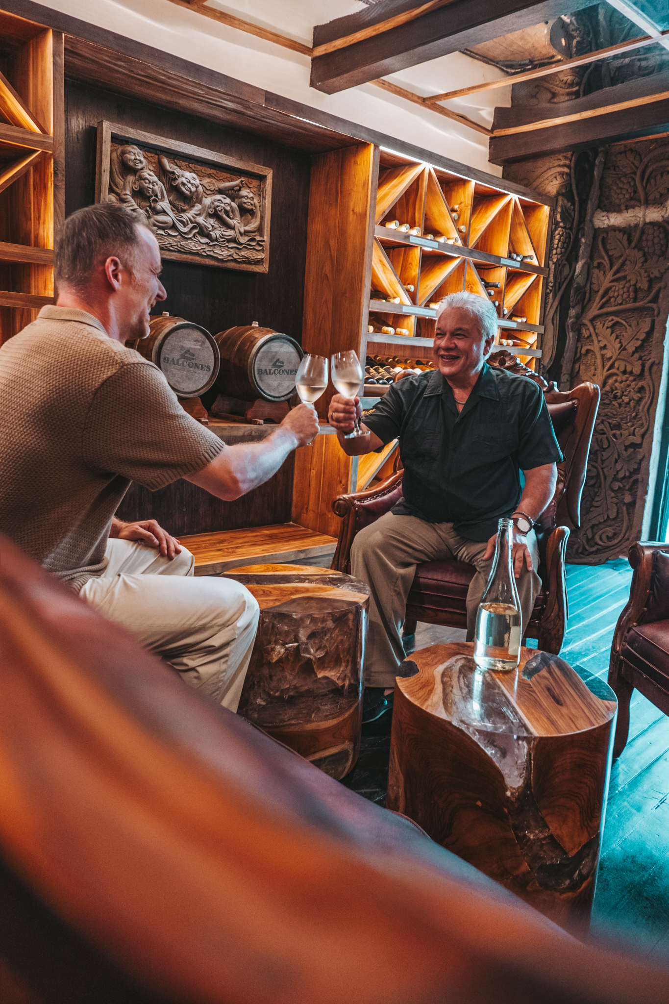
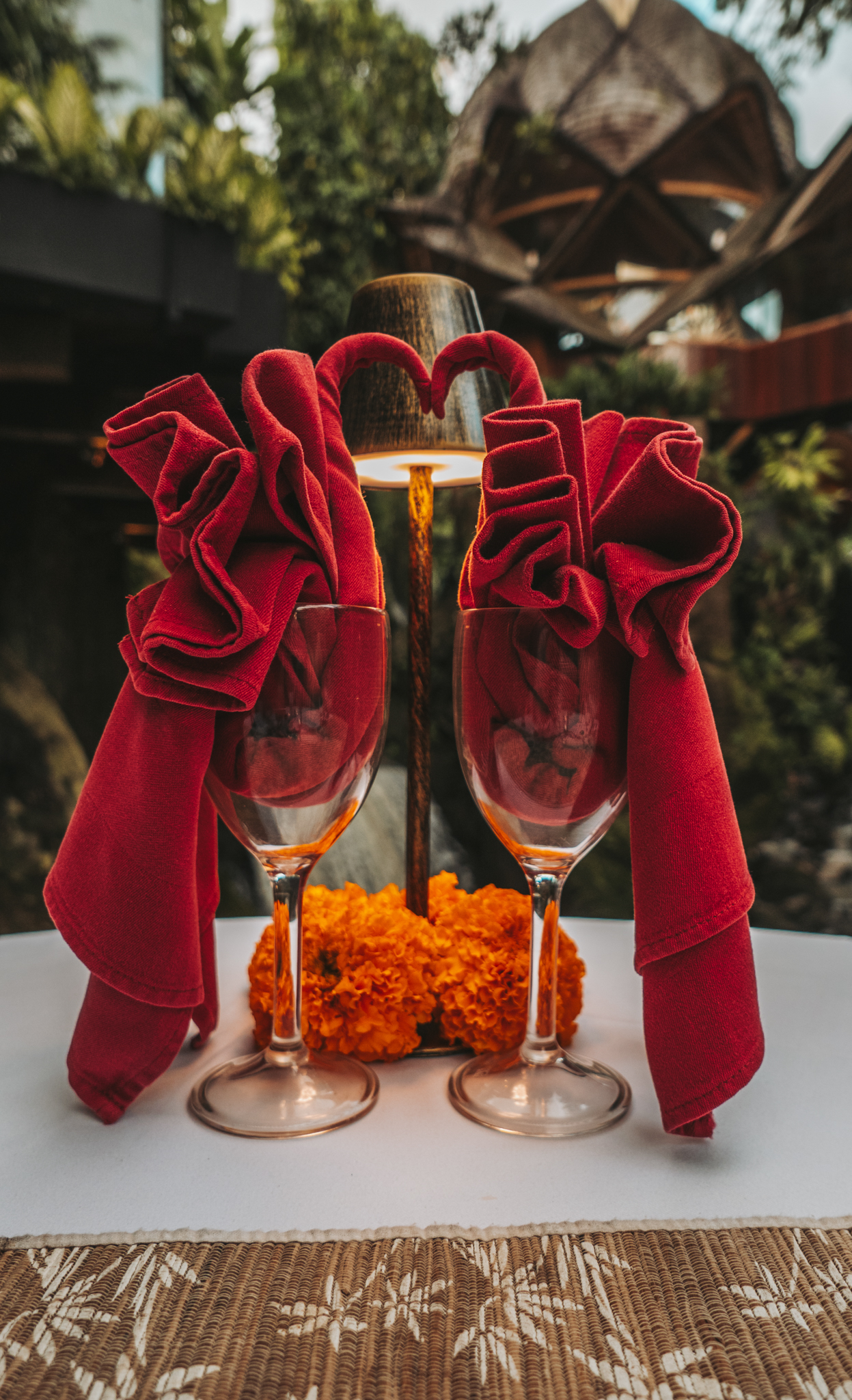
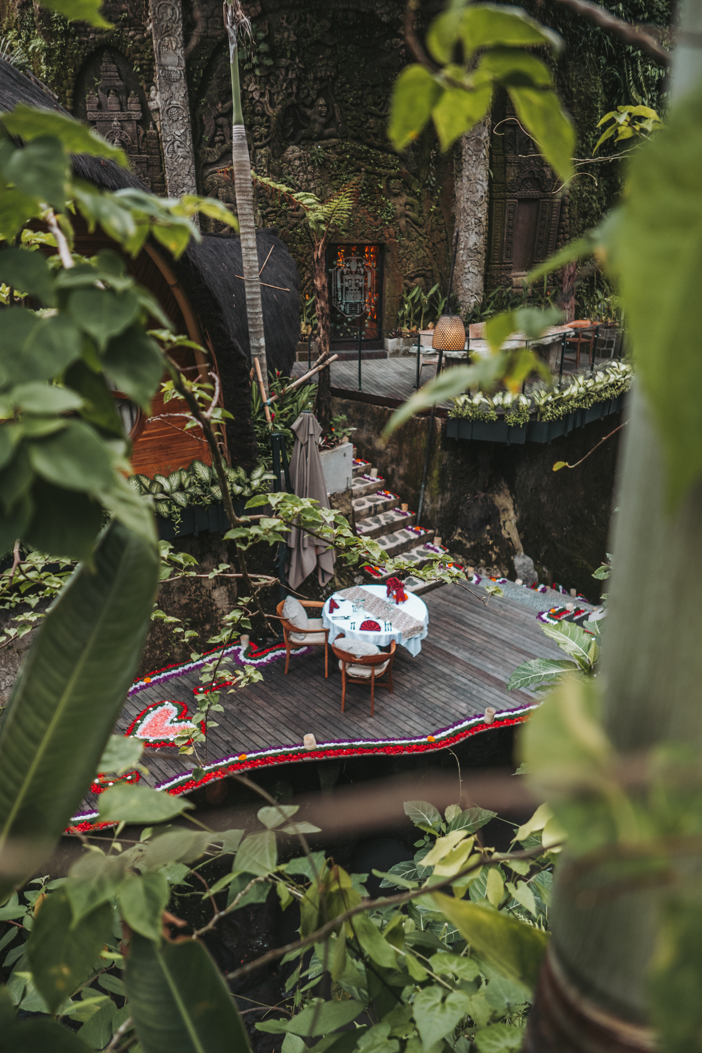
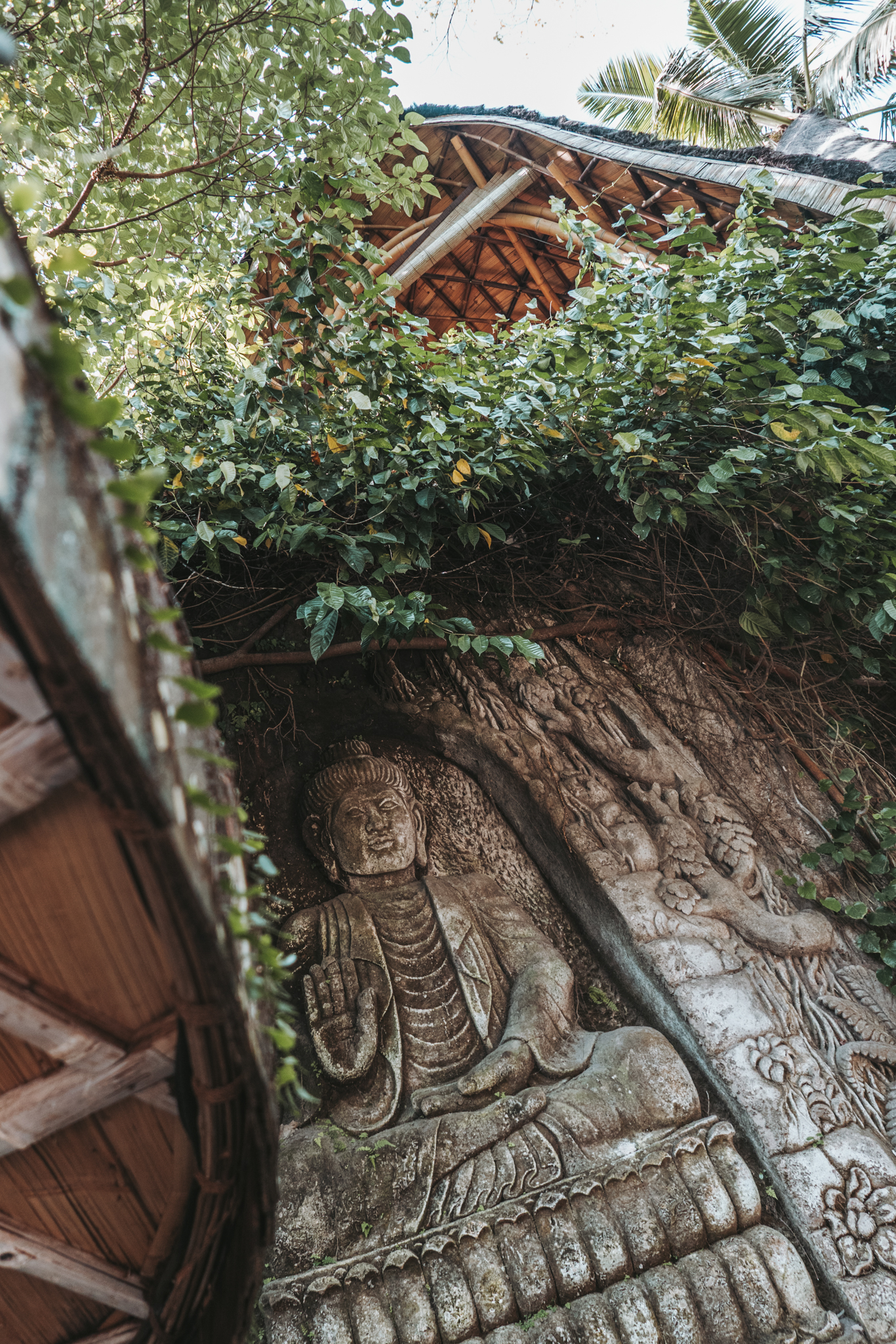
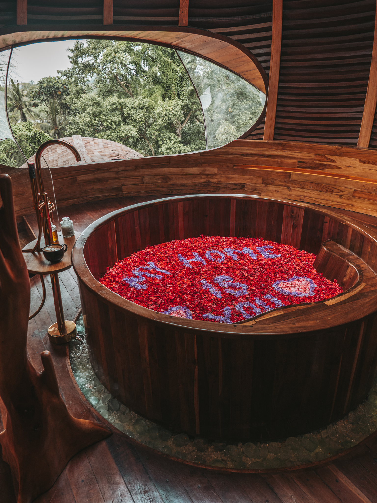
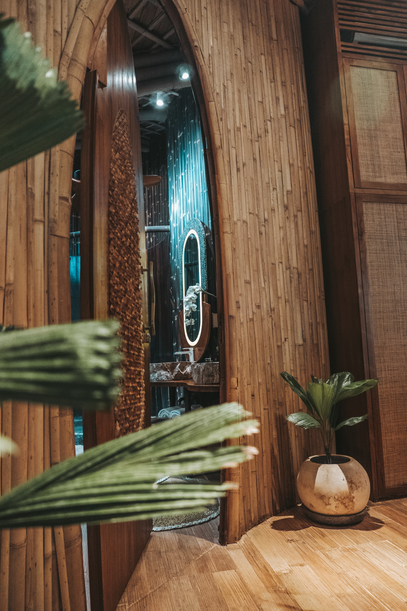
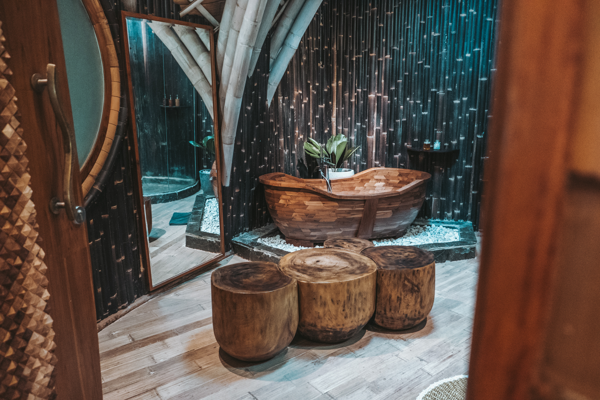
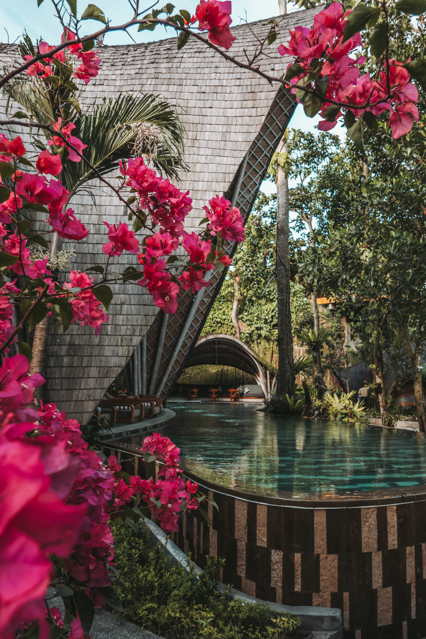
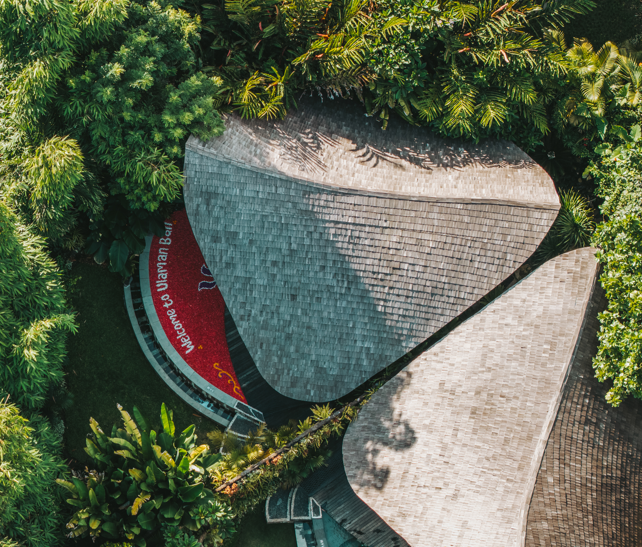
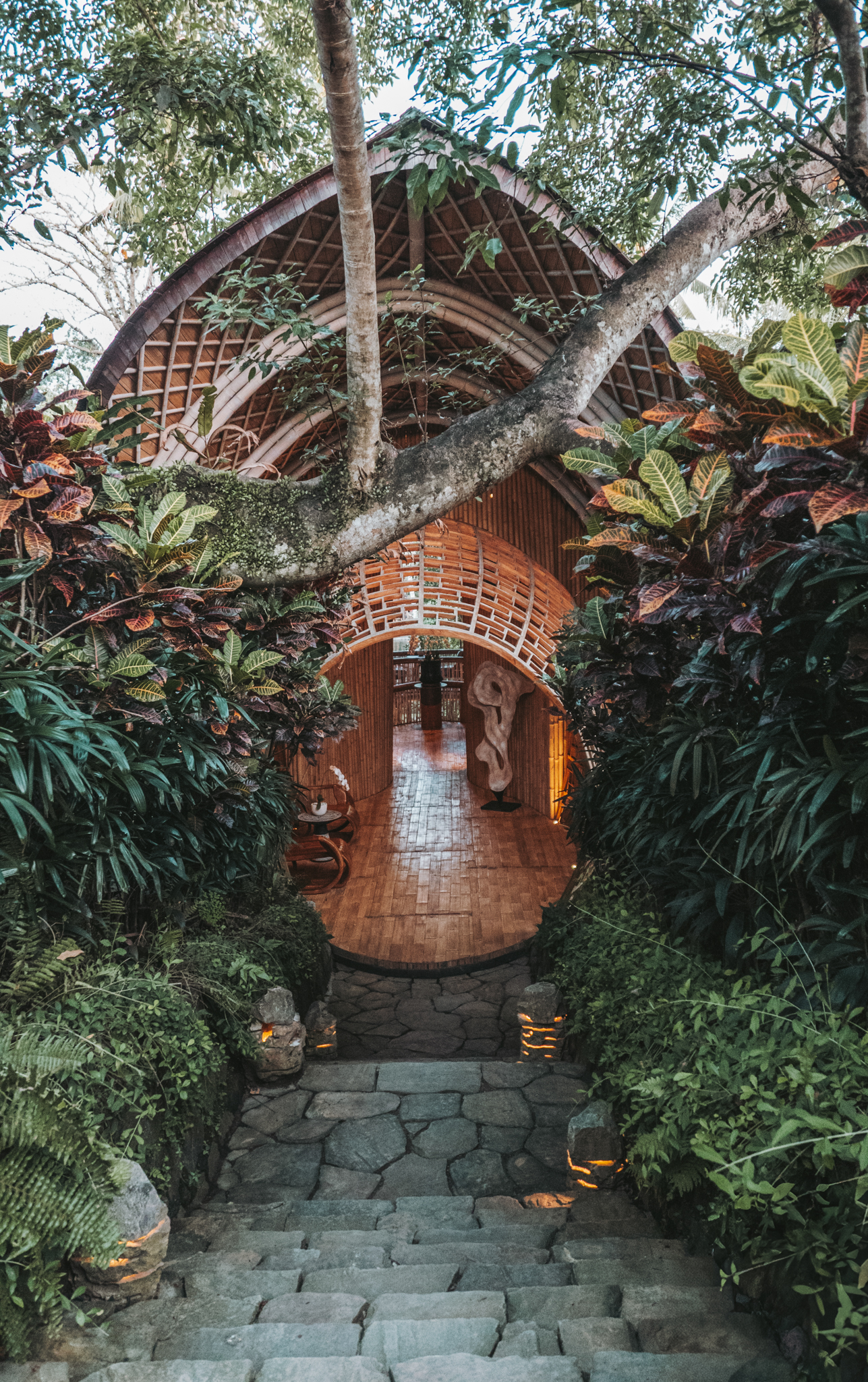
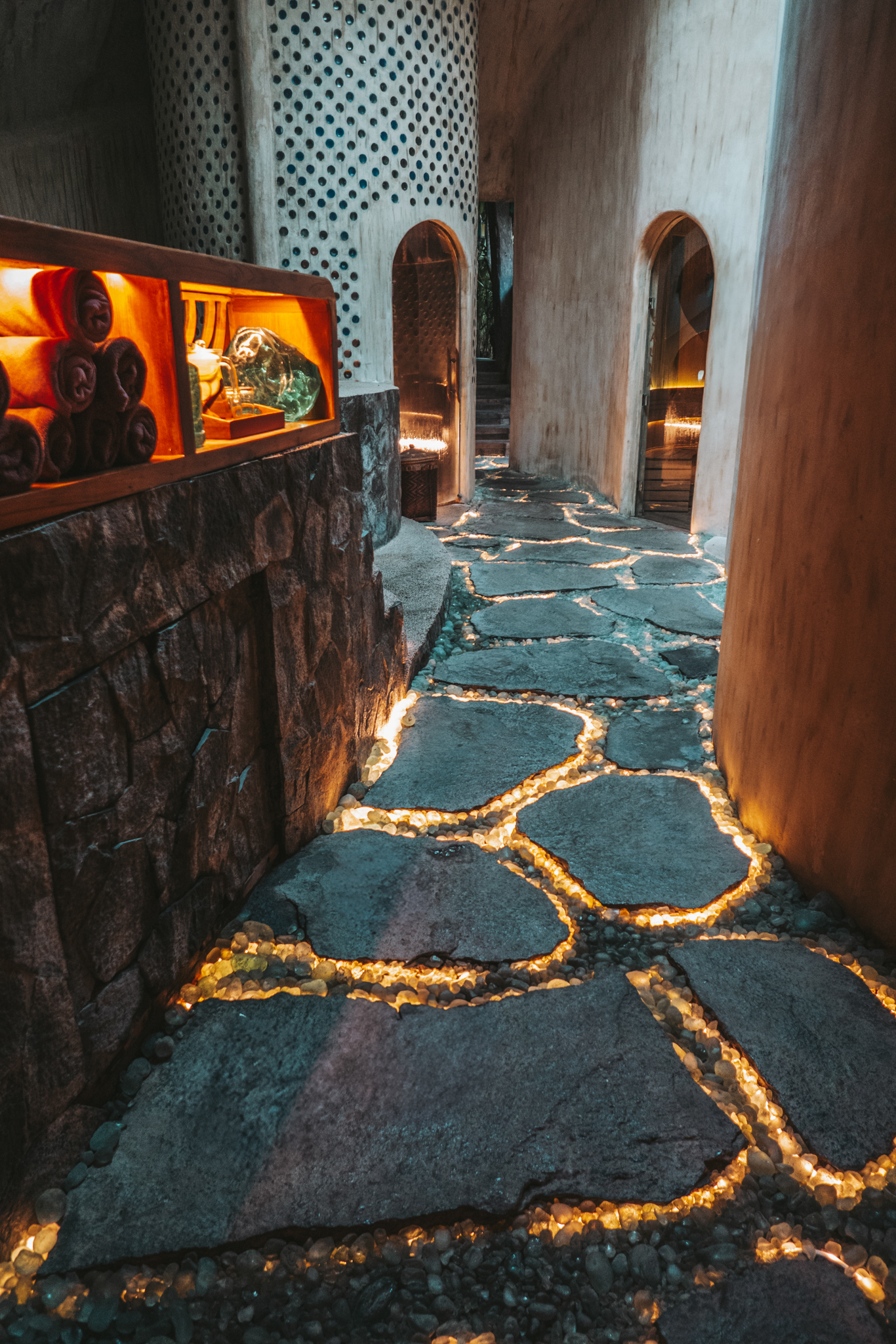
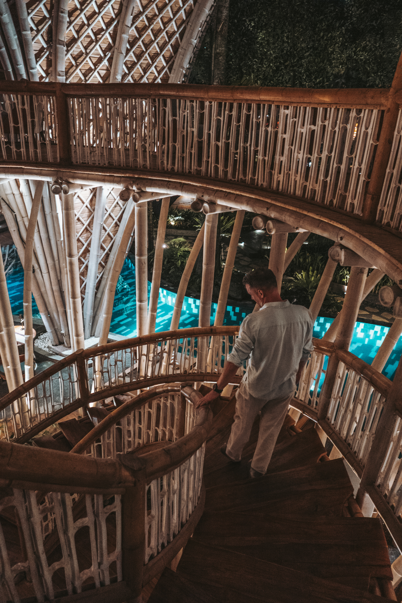
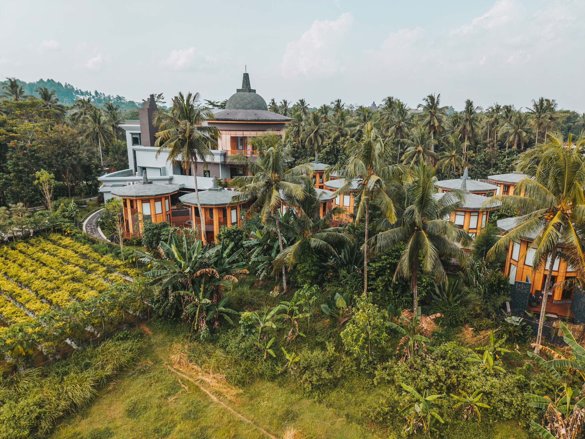
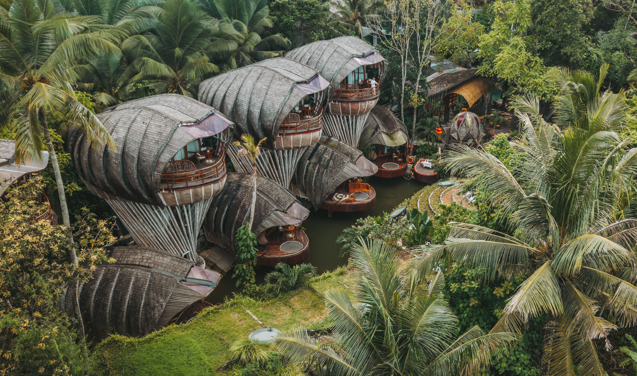
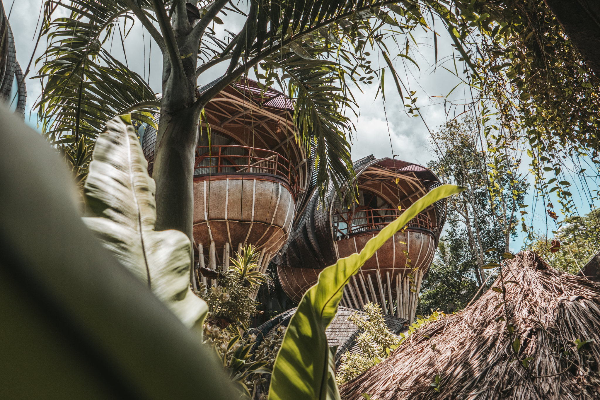
Ulaman Eco Luxury Resort sits in the jungle above Tabanan, Bali — away from the coast, away from the noise, away from everything that makes most Bali resorts feel interchangeable. The architecture is bamboo and stone. The pools reflect the canopy. The silence is a design decision.

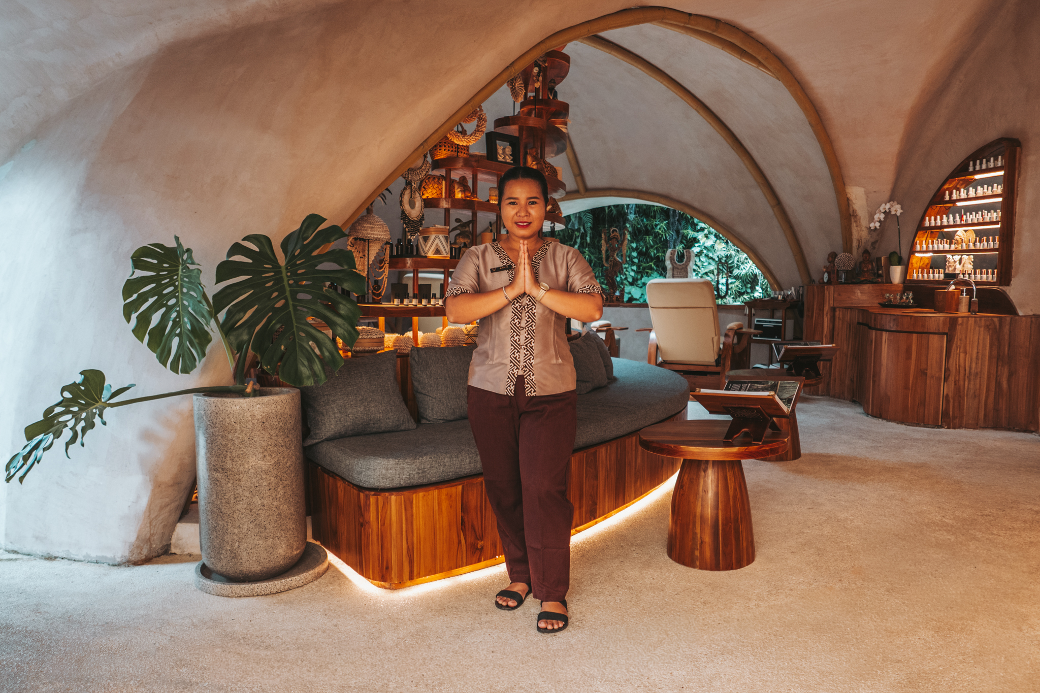
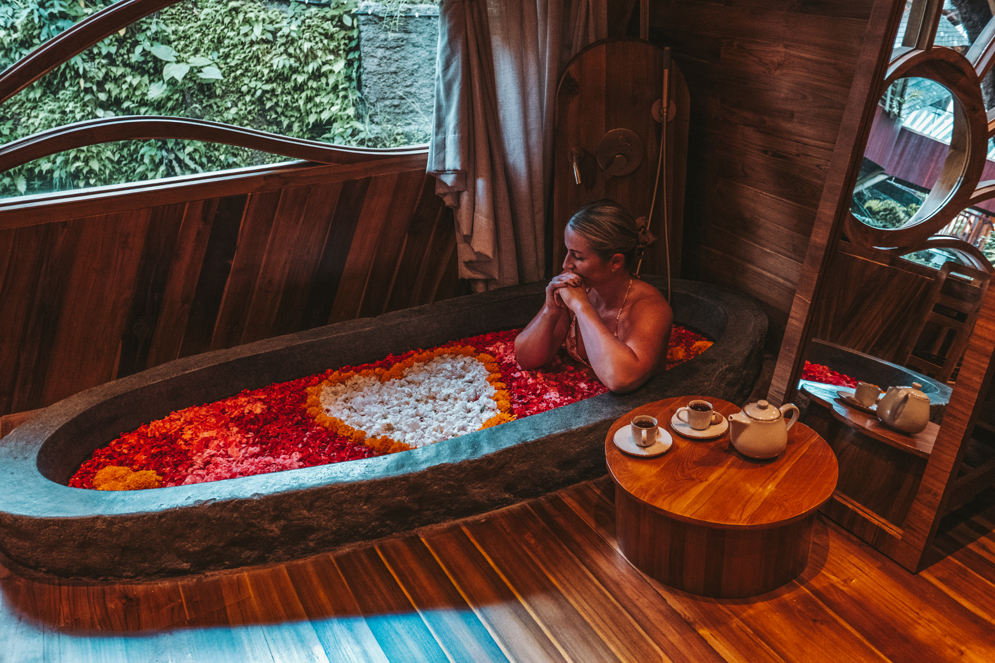
This is not a property that leads with spectacle. It earns its guests slowly, through atmosphere and detail and the specific quality of stillness it creates. The creative challenge here was the same as the brand challenge: how do you communicate something that only reveals itself to those who slow down enough to feel it?

scope of work

Multiple visits.
A deepening visual language.

Ulaman wasn't a single trip. It was a relationship built across time — multiple stays, multiple seasons, a growing familiarity with how the light moves through the property at different hours and in different moods.

That continuity matters. The first visit teaches you the obvious: the architecture, the pools, the jungle views. The later ones teach you the rest — the way mist sits in the valley at dawn, the texture of the materials after rain, the rhythm of how guests move through the space when they've finally exhaled. You cannot capture that on a first day. You have to earn it.

I held the creative direction across all productions, working closely with the property team to understand what Ulaman wanted to communicate — and what it didn't.

visual approach

Light, texture, silence.
In that order.

The visual language for Ulaman was built around three things: natural light, organic materials, and the absence of noise in the frame.

Every shot was observed, not arranged. Reflections on water. The warmth of bamboo at golden hour. A robe draped over a chair, a cup of tea going cold, the space between a guest and the view they're looking at. These are the moments that tell the truth about a place — not the wide-angle hero shots that every resort has, but the quiet details that accumulate into a feeling.

The editing follows the same principle. Slow. Patient. Nothing forced. The colour palette stays close to what the jungle actually looks like — deep greens, warm earth tones, the soft gold of late afternoon. Nothing was corrected into something it wasn't.

the result

A visual identity that moves as slowly as the place itself.

Across multiple productions, Ulaman now has a consistent visual world — one that holds together across their website, social channels, and campaign materials without ever feeling like it was produced in a rush or by someone passing through.

That consistency is the point. Guests who follow Ulaman over time feel the same thing in every image: calm, intention, a deep connection to place. By the time they book, they already know how it feels to be there. That recognition is what good hospitality content is supposed to do.