The surprising lessons from working with high-end destinations — and why less is almost always more.
The first time a client asked me to remove a photo from a campaign because it was "too real," I didn't understand what they meant.
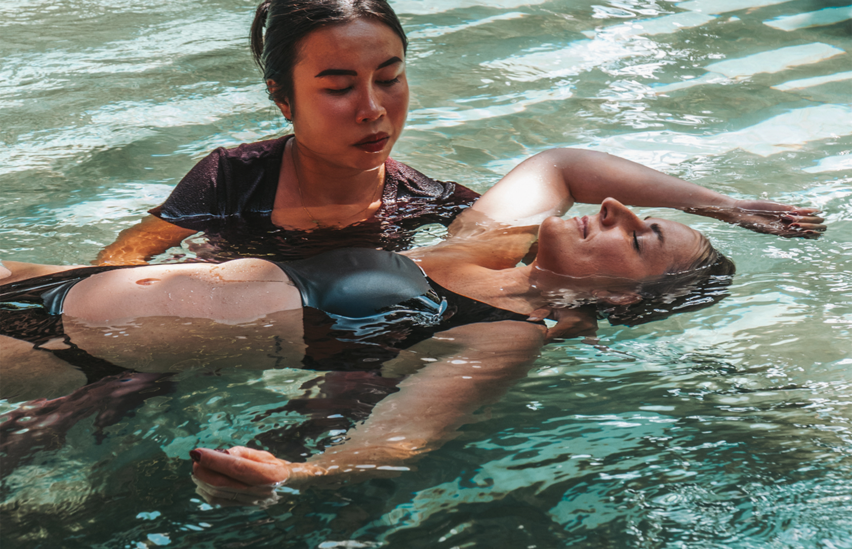
The image was of a guest at breakfast. She was alone, reading, slightly underdressed, hair not quite done. The light was extraordinary — soft, early, the kind that makes everything look like a memory. She looked completely at ease. Completely herself. It was, I thought, one of the most honest and beautiful images from the entire shoot.
They wanted the couple in matching linen. The arranged fruit plate. The view.
I delivered what they asked for. The campaign performed fine. But I kept thinking about that image — about what it communicated that the linen couple couldn't. Something true. Something that would have spoken directly to a certain kind of traveller who is exhausted by perfection and hungry for a place that would let them just be.
That tension — between the polished ideal and the lived truth — is something I've navigated on every luxury project since. And slowly, I've come to understand it not as a conflict but as the central creative question of the whole industry.
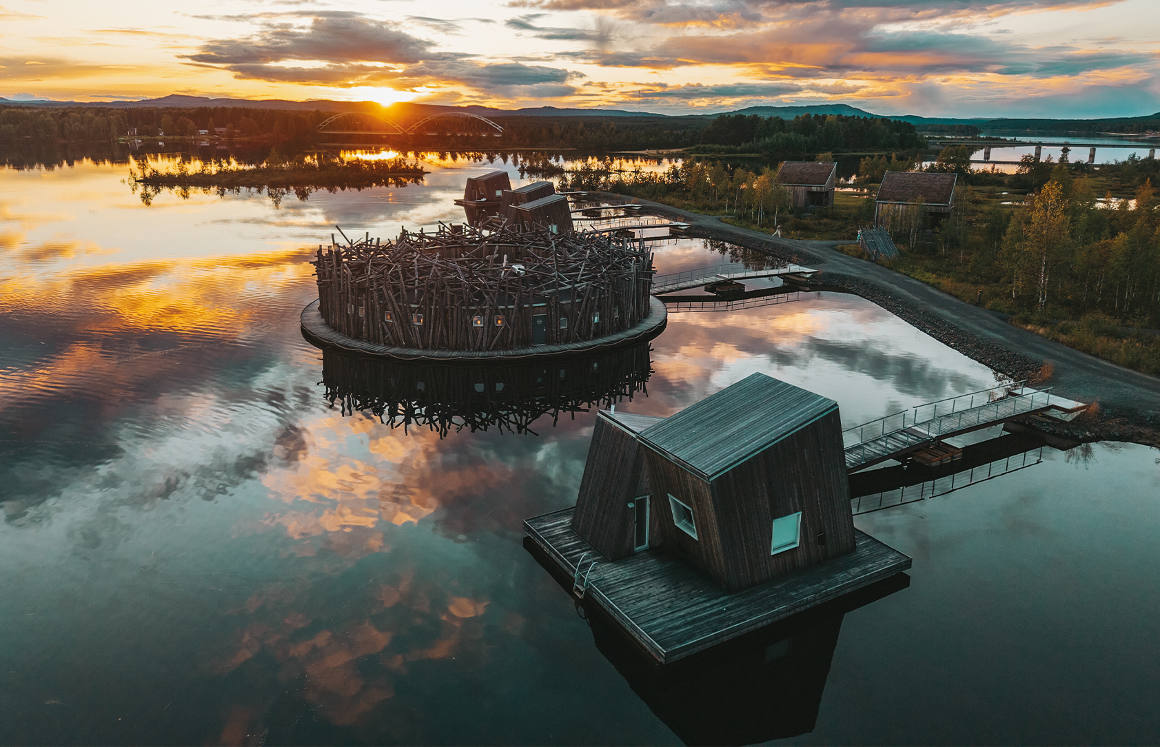
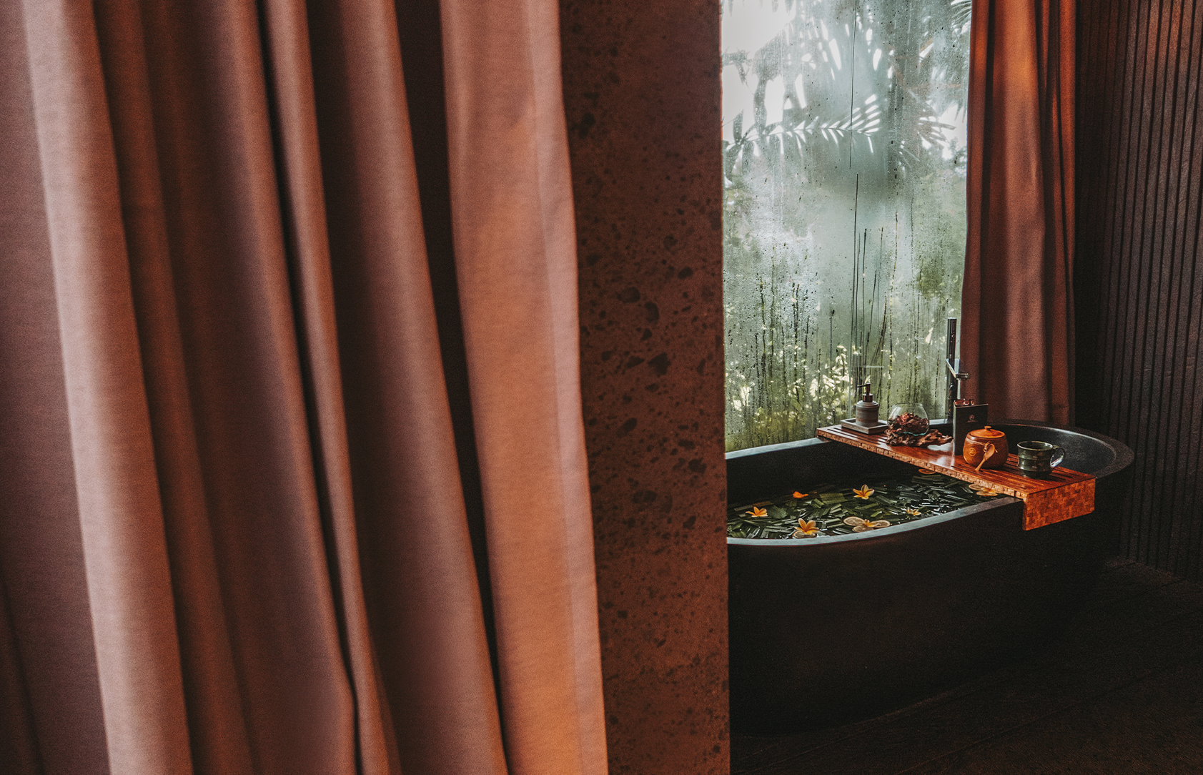
What luxury actually sells
Luxury hospitality doesn't sell thread counts or architecture or Michelin-starred menus. It sells the feeling of being exactly where you're supposed to be. The relief of it. The permission to slow down, to be looked after, to exist without agenda.
The visual language of most luxury brands, however, sells something else entirely — an idea of perfection that is simultaneously aspirational and slightly alienating. Everything in its place. Nothing out of order. Spaces that look like no one has ever actually lived in them. People who look like they were cast, not found.
This creates a strange paradox. The more polished the imagery, the more it communicates exclusivity — but also, increasingly, distance. And distance is the enemy of desire. You don't ache for something you can't imagine yourself inside of.
The brands that consistently outperform their category have figured this out. Their visuals are still elevated — the craft is still there, the light is still considered, the compositions are still intentional. But there's something human in them. Something that says: this place is extraordinary, and you belong here.
That's a much harder thing to make than perfect.
Less information, more feeling
The biggest shift in my work came when I stopped trying to show everything and started asking what a single image needed to make someone feel.
Luxury brands, particularly in hospitality, have a tendency to over-document. Every room. Every amenity. Every view from every angle. The logic is understandable — you've invested significantly in a beautiful property, and you want people to see it. But the effect is the opposite of the intention. When you show everything, you create a catalogue. And catalogues don't create desire. They create comparison shopping.
The properties I admire most — the ones with genuinely covetable visual identities — are deliberately incomplete. They show you enough to make you feel something and leave enough out to make you want to know more. They understand that mystery is a luxury in itself. That restraint communicates confidence. That a single perfectly chosen image does more work than twelve comprehensive ones.
This is counterintuitive for most clients. It requires trust — in the work, in the audience, in the idea that less information can create more desire. But once you've seen it work, you can't unsee it.
The details that do the heavy lifting
Working in luxury taught me to pay attention to the things that barely register consciously but land somewhere deeper.
The weight of a linen napkin in a photo. The particular patina on a wooden floor that tells you this place has history. The way a staff member leans toward a guest — not servile, not formal, but genuinely attentive. The quality of the quiet in an image. Whether a space feels inhabited or staged. These micro-signals communicate more about a brand's actual character than any headline or tagline ever could.
High-end travellers — the ones luxury hospitality brands are competing for — are extraordinarily good at reading these signals. They've stayed in enough places to know, almost instantly, whether a brand's visual identity is built on something real or constructed on top of something ordinary. They feel the difference between a photograph taken by someone who understood the place and one taken by someone who just photographed it.
This is why craft matters. Not for its own sake — not as a form of aesthetic self-indulgence — but because the audience you're speaking to will notice the difference, even if they can't articulate why.
What "less is more" actually requires
It's worth saying that restraint is not the same as simplicity, and minimalism is not the same as emptiness. Less is more is one of those phrases that gets used to justify laziness as often as it gets used to describe genuine creative discipline.
What it actually requires is extreme selectivity — which requires extreme understanding. You can only leave things out if you're certain that what remains is doing enough. You can only be incomplete if you've chosen your fragments with enough precision that they add up to something whole. Restraint without understanding is just absence.
This is what luxury hospitality has taught me more than anything else: that the most powerful visual choices are acts of editing, not production. The image you don't take. The room you don't show. The moment you let pass because the next one will be truer. Every decision to leave something out is a decision about what matters most — and making that decision well requires knowing a brand deeply enough to be trusted with what it doesn't show.
The image that stays with you
I still think about that woman at breakfast. The one they asked me to cut.
I understand now why they were hesitant — it didn't match the visual language they'd built, it would have required a conversation about repositioning, it was easier to use the linen couple. These are real constraints. I work within them all the time.
But I also understand what that image had that the linen couple didn't. It had a person in it. A real one, in a real moment, in a place that was clearly letting her be herself. And that — more than any perfectly arranged fruit plate — is what the right guest would have recognised as luxury.
The lesson I carry from that moment isn't that authenticity always wins. It's that the most sophisticated visual storytelling in luxury hospitality finds a way to hold both — the elevation and the humanity, the beauty and the truth. That's the tension worth working in. That's where the interesting work lives.
Working on a brand that's ready to think differently about its visual identity?